Translation Games
Last summer I was chosen to take part in a project with King's College and Queen Mary's Universities, involving the language departments, translators, film makers, textile designers and artists. It was a very valuable experience, exploring translation and interpretation; not just through words but also visual art, audio and film.
Check out the websites where you can find more information on the original text that was translated and re-translated in a chain of languages, the curators, artists involved and their work, the project itself and further events.
http://www.kcl.ac.uk/artshums/ahri/eventrecords/2013-2014/Festival/Translation-Games.aspx
https://www.facebook.com/TranslationGames
Having received the text in Spanish, I had to spend some time translating it for myself to understand it as best I could, not only in the English language, but also in terms of ideas, concepts, and the general gist of the text.
The essence of the text brought together two ideas, two characters, and two sides of a story. One of these was softer and more gentle, the other harsher and more ruthless, yet both with their own insecurities. These two elements came together, conceived and built something together, yet were unable to control it; it constructed for itself its own flavour and form.
The two elements, or characters, then overtaken by their situation, eventually break apart, and try as they might, cannot change the situation. They watch as some sort of obliteration occurs, and they are powerless.
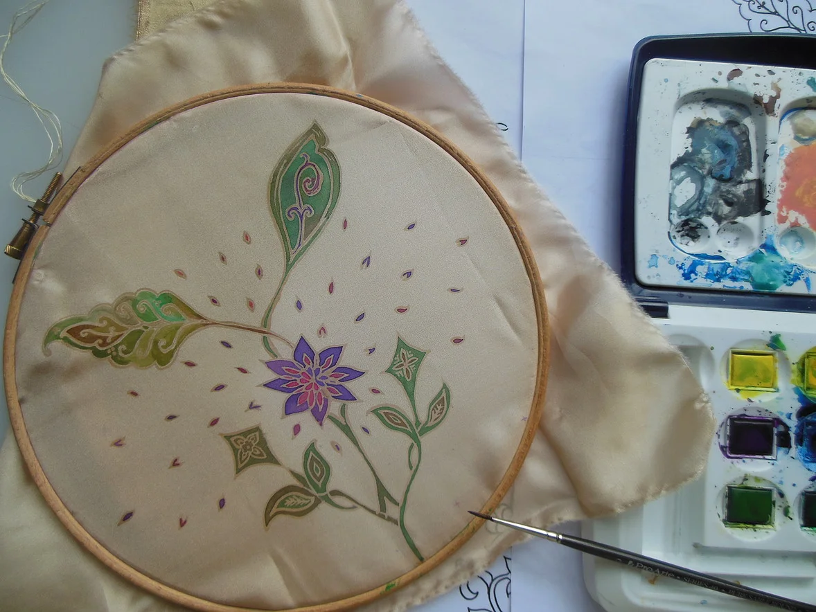
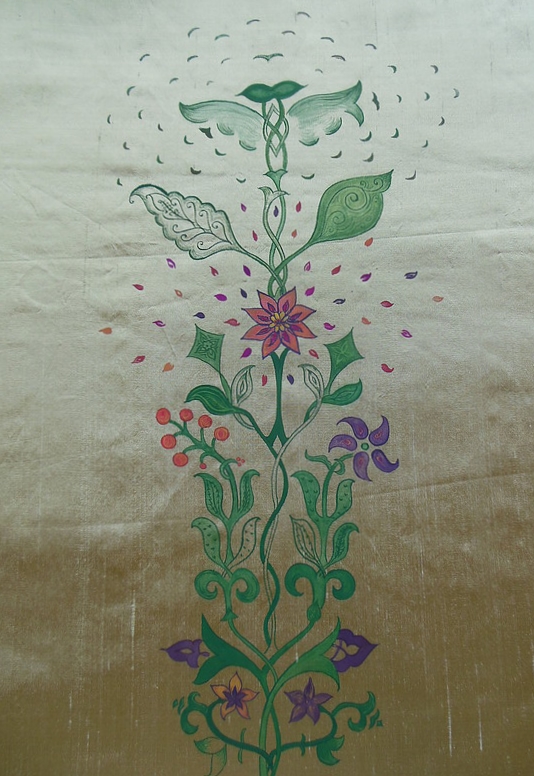
Visually inspired by the patterns and motifs found in La Gran Mezquita, in Cordoba, Spain, I chose to represent this using gouache paint and raw silk/Indian silk (after tests on khadi paper/watercolour and silk habotai/silk paint and watercolour) as I felt that a strong textured fabric and density of colour best represented the text. The design itself has two elements growing together, towards each other and around each other, occasionally mirroring their motifs. They are, however, varying in shade, tone, colour, and even the form and pattern of the design depends on which element is being represented – one softer, swirling in and out of itself, and the other less so, with sharper angles and straighter lines. The two elements, or vines, come together in a floral explosion of colour, and go on to grow towards something undefined. This then grows beyond itself and the two elements start to disintegrate, leaving each other ‘al borde de aquel abismo en expansiòn’.


